First of all I'm glad the the TPC is now including storm surge on their main page.
Everyone here understands the color code, but what about the general public.
Red is always understood to be the worst case, but in this instance. It is the best.
How many of the general public understands that if the red zone floods all the rest of the zones are under water.
How many are relieved that they live in a blue zone instead of realizing that they are in the worse zone possible.
Just a thought, (From someone who lives in the blue zone).
Storm Surge Flooding Map Misinterpretation
Moderator: S2k Moderators
Forum rules

The posts in this forum are NOT official forecasts and should not be used as such. They are just the opinion of the poster and may or may not be backed by sound meteorological data. They are NOT endorsed by any professional institution or STORM2K. For official information, please refer to products from the National Hurricane Center and National Weather Service.
-
OuterBanker
- S2K Supporter

- Posts: 1704
- Joined: Wed Feb 26, 2003 10:53 am
- Location: Nags Head, NC
- Contact:
-
wxman57

- Moderator-Pro Met

- Posts: 22480
- Age: 66
- Joined: Sat Jun 21, 2003 8:06 pm
- Location: Houston, TX (southwest)
Re: Storm Surge Flooding Map Misinterpretation
OuterBanker wrote:First of all I'm glad the the TPC is now including storm surge on their main page.
Everyone here understands the color code, but what about the general public. Red is always understood to be the worst case, but in this instance. It is the best. How many of the general public understands that if the red zone floods all the rest of the zones are under water. How many are relieved that they live in a blue zone instead of realizing that they are in the worse zone possible. Just a thought, (From someone who lives in the blue zone).
Are you referring to the storm surge inundation maps or the storm surge watch/warning maps? The top two images below are storm surge inundation map, but they are NOT a storm surge forecast. The maps represent the 90th percentile of possible storm surge inundation, meaning that there is only a 10 percent chance that the storm surge could be higher at any location. Red is the worst - water depth greater than 9 ft. Blue is possible water depth between 1 and 3 ft, so blue is much better than red. The lower image is the new surge watch/warning map. Again, red is worse - a warning vs. a watch.
Because of the fact that storm surge height is highly dependent upon the precise track of the storm, the size of the wind field, and the timing of landfall (tides-wise), the NHC no longer issues deterministic storm surge forecast graphics. They use a probabilistic approach to take into account all of the uncertainties in the forecast. Think of the maps as a realistic worst-case for any one location.
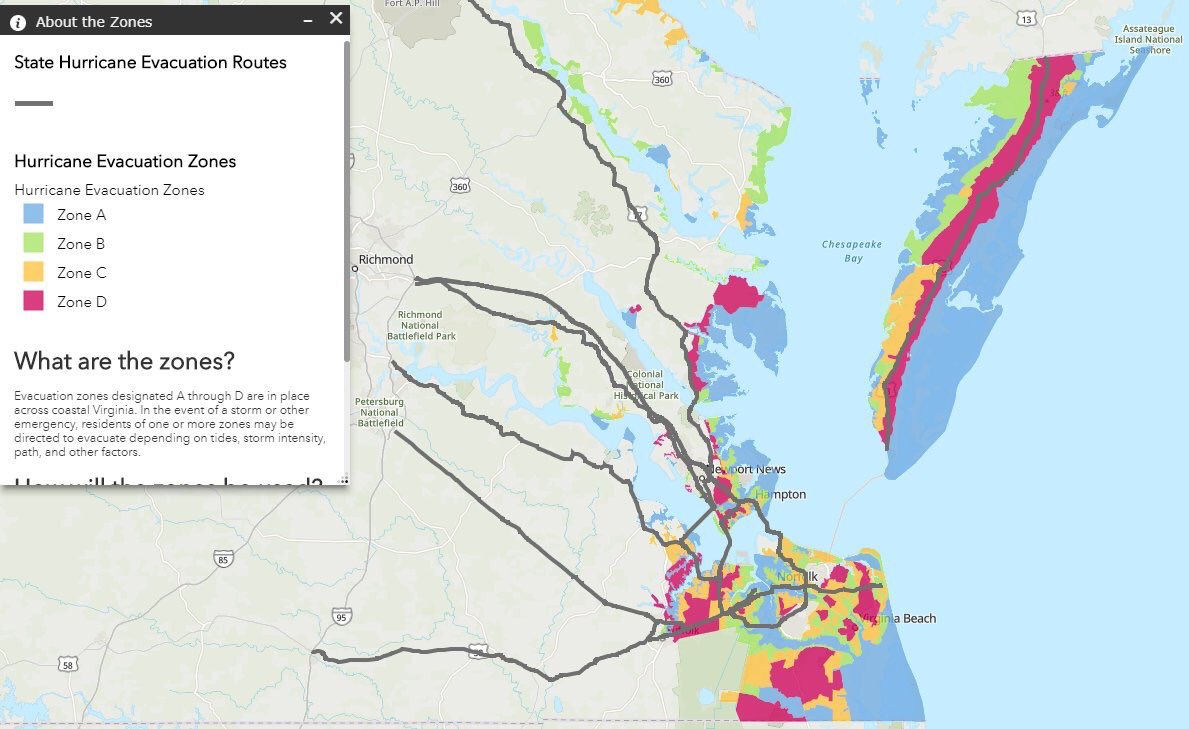
Finally, if you are not talking about NHC storm surge graphics but instead meaning your local government evacuation zones (example 4th map below), you'll have to take up those zone colors (A-D) with your local government. The NHC/TPC has nothing to do with them.


3 likes
Re: Storm Surge Flooding Map Misinterpretation
OuterBanker wrote:Red is always understood to be the worst case, but in this instance. It is the best.
Can you please give an example of what you're talking about here? Either you're talking about a completely different product than I'm thinking of or you're misreading the map.
0 likes
Who is online
Users browsing this forum: No registered users and 176 guests