UPDATED (06/25): New forecast track map fixed!

This is the general tropical discussion area. Anyone can take their shot at predicting a storms path.

Moderator: S2k Moderators

Forum rules

The posts in this forum are NOT official forecasts and should not be used as such. They are just the opinion of the poster and may or may not be backed by sound meteorological data. They are NOT endorsed by any professional institution or STORM2K. For official information, please refer to products from the National Hurricane Center and National Weather Service.

Help Support Storm2K
Message
Author
ncweatherwizard
Professional-Met
Professional-Met
Posts: 1243
Joined: Wed Sep 03, 2003 9:45 am
Location: Ft. Collins, CO

UPDATED (06/25): New forecast track map fixed!

#1 Postby ncweatherwizard » Thu Jun 12, 2008 6:57 pm

All storm cases are now fixed! A few examples are below. I do appreciate much of the feedback, and welcome any additional feedback on the products below. Thanks! :)

Note: You may have to refresh the cache for some of the images if you have viewed the link before.

New maps (with cone):

2007 Dean

2005 Wilma

2003 Isabel

2005 Ophelia

2004 Jeanne


Scott
Last edited by ncweatherwizard on Wed Jun 25, 2008 5:31 pm, edited 4 times in total.
0 likes   

Derek Ortt

#2 Postby Derek Ortt » Thu Jun 12, 2008 8:47 pm

YIKES!!!

There is a reaosn that NHC decided against the circles, and Ophelia is exactly why. It is far too confusing and next to impossible to see the forecast track. Also confusing when an area is under 3 or more circles

Just the line would be far clearer, or some type of objective cone (which is what I am HOPING to have next season)
0 likes   

User avatar
boca
Category 5
Category 5
Posts: 6369
Age: 60
Joined: Mon Dec 15, 2003 8:49 am
Location: Boca Raton,FL

Re:

#3 Postby boca » Thu Jun 12, 2008 9:52 pm

Derek Ortt wrote:YIKES!!!

There is a reaosn that NHC decided against the circles, and Ophelia is exactly why. It is far too confusing and next to impossible to see the forecast track. Also confusing when an area is under 3 or more circles

Just the line would be far clearer, or some type of objective cone (which is what I am HOPING to have next season)


Scott, I agree with Derek on the circles because with Ophelia I couldn't tell which direction the storm was heading.86 the circles.
0 likes   

ncweatherwizard
Professional-Met
Professional-Met
Posts: 1243
Joined: Wed Sep 03, 2003 9:45 am
Location: Ft. Collins, CO

Re: New forecast track maps: feedback appreciated

#4 Postby ncweatherwizard » Thu Jun 12, 2008 9:58 pm

I do concur--Ophelia is a mess. I want to try a cone and see what it looks like, but I haven't figured out yet how to fill in a "polyline", which is what my circles are: I wrote a subroutine to calculate points a set radius from the center using great circle geometry, then connected the dots. I also don't know if it's even possible to control opacity either.

What would be the method to making a cone anyway? I suppose one could start from an initial point and then draw a line that is, for example, tangent to the 24hr circle but not passing through the 12 hour circle and fill the area in between the lines on either side of the circle. It wouldn't be smooth or perfect, but it would be approximate. Still, a stationary storm is a special case where that doesn't apply and you would just have to fill in everything within the outermost circle.
0 likes   

User avatar
KWT
Category 5
Category 5
Posts: 31415
Joined: Tue Aug 17, 2004 11:02 am
Location: UK!!!

#5 Postby KWT » Fri Jun 13, 2008 4:44 am

Yeah those slow moving systems with that sort of system would look very messy indeed and that shows with Ophelia.
By the way how did you work out the radius of the circles?
0 likes   

ncweatherwizard
Professional-Met
Professional-Met
Posts: 1243
Joined: Wed Sep 03, 2003 9:45 am
Location: Ft. Collins, CO

Re: New forecast track maps: feedback appreciated

#6 Postby ncweatherwizard » Fri Jun 13, 2008 11:56 am

The circles represent my five year mean forecast error (in nm) at each time period. That right there might answer your question. :D

But to be thorough.... To make things easy, I approximated that one degree of latitude is 60nm at all latitudes (not quite true, which shows up in some circles as a small hump at the top or bottom of a circle if you look closely). Using this I determined a maximum and minimum latitude, then looped through these latitudes with a small step size to calculate a longitude (now the only unknown in the great circle formula) for each latitude in the group. Then I had a bunch of points, and just connected them.
0 likes   

ncweatherwizard
Professional-Met
Professional-Met
Posts: 1243
Joined: Wed Sep 03, 2003 9:45 am
Location: Ft. Collins, CO

Re: New forecast track maps: feedback appreciated

#7 Postby ncweatherwizard » Fri Jun 13, 2008 12:08 pm

Appreciate the comments so far---they're very helpful. :) Aside from Ophelia, how does this format look? Any comments about other things? I'm thinking up the plans for a "slow storm" mode so that only larger circles show up if two circles have centers close enough to each other, but if the circle approach is fundamentally a bad one altogether, I don't want to spend much time on it.
0 likes   

Derek Ortt

#8 Postby Derek Ortt » Fri Jun 13, 2008 12:25 pm

I dont like the circle approach at all, to be honest.

Either a line or a cone is the best way to go
0 likes   

tolakram
Admin
Admin
Posts: 20017
Age: 62
Joined: Sun Aug 27, 2006 8:23 pm
Location: Florence, KY (name is Mark)

Re: New forecast track maps: feedback appreciated

#9 Postby tolakram » Fri Jun 13, 2008 1:18 pm

I like it well enough, honestly. I agree a cone would be better, mostly, but I understand the circles and don't find them that unreadable.
0 likes   

User avatar
SouthFloridawx
S2K Supporter
S2K Supporter
Posts: 8346
Age: 46
Joined: Tue Jul 26, 2005 1:16 am
Location: Sarasota, FL
Contact:

Re: New forecast track maps: feedback appreciated

#10 Postby SouthFloridawx » Fri Jun 13, 2008 3:43 pm

Well I found it fairly easy to read. Each forecast point is exactly in the center of the corresponding circle (Catagory or Tropical Storm). Of course I'm not sure how this would be for the public to read though. The cone can be very kind of confusing to the public also. The thing I like about your graphic is that you have hourly increments, where the NHC does not. The NHC method is probably a bit easier for the public to read as in it is marked by Time and Day. Either way, I like what you have done here.

Image
0 likes   

jinftl
Category 5
Category 5
Posts: 4312
Joined: Tue Aug 31, 2004 4:47 pm
Location: fort lauderdale, fl

Re: New forecast track maps: feedback appreciated

#11 Postby jinftl » Fri Jun 13, 2008 4:14 pm

At first glance, i thought the circles represented radii of winds from storm
0 likes   

Chris_in_Tampa
Category 5
Category 5
Posts: 5077
Age: 42
Joined: Thu Jun 21, 2007 11:06 pm
Location: Tampa, Florida, USA
Contact:

Re: New forecast track maps: feedback appreciated

#12 Postby Chris_in_Tampa » Fri Jun 13, 2008 11:39 pm

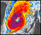
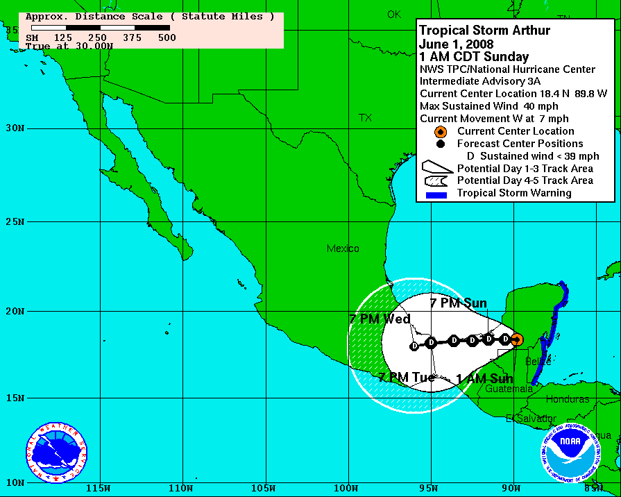
About two years ago I tried to create an NHC error cone. After a long time trying, I failed miserably at it. Problem is, what is the official cone? It is based on the error, but how should it look? I spent along time making good progress seemingly, other than when points were close together, but finally realized something, I didn't know how it should work because I didn't know how the official cone was constructed. The "cone of uncertainty" is different everywhere you look. (and not just on TWC where they create their own cone)

I realized that until there is something proper laid out, I couldn't do the one the NHC does. I thought about trying to inquire to the NHC about it, but I'm sure they have better things to do. Does anyone know of a scientific paper or something that lays out how it is done?

I think I have a work around for the problems however, though some sacrifices must be made. Take a look here:
http://www.tropicalatlantic.com/temp/errorcones.jpg

There still is the problem of whether lines should be straight or curved. I don't have anything scientific to base a curve on. Is there some formula that could generate a curve that would approximate an imaginary error circle at every point on the line? Way too confusing! So I would think the best way would be the straight line method.

You can see the examples. You are creating one shaded region at a time between circles. From the 0 to 12, 12, to 24, and so on. The sacrifices? The black line outlining the whole thing. In Google Earth and Google Maps, which is where I will eventually design mine, I see it as a positive. You can choose what to display. You can have all of the example I showed, except the third row of images, which has a line outlining all of them. The math would get all screwy with so many overlapping circles. I went nuts when I tried to figure it out.

Now you could probably create the cone that is exampled at the end in an image like you have. However, it has a fill. If you had a solid fill, all would be good. If you have a transparent fill, like you can do in Google Earth, then overlapping circles would, I think, but have yet to get around to trying it, overlap with a stronger color where the parts of the cone overlapped.

But, that is the only idea I have.

And this idea is still unofficial because I don't know the specifics of how the NHC uses those error circles. So if I create one, I don't know how to even describe it. But, since I would make error circles and tons of other data available as overlays in different combinations, perhaps people would understand the complexities.

If you ever find out anything about the error cone, let me know.
0 likes   

ncweatherwizard
Professional-Met
Professional-Met
Posts: 1243
Joined: Wed Sep 03, 2003 9:45 am
Location: Ft. Collins, CO

Re: New forecast track maps: feedback appreciated

#13 Postby ncweatherwizard » Sat Jun 14, 2008 7:38 pm

First of all, everyone's input is definitely appreciated: I'm currently working on rendering a cone.

I couldn't tell you what the method is for rendering that NHC cone though. Surely, their software is a little more user friendly, but somebody had to write it at some point.

I spent much of Friday slogging through the mathematics needed to make a cone given some of my constraints. One, my circles are actually polygons with many sides so that it approximates a circle. None of the features are mathematical functions, but rather logically computed. Visually, I came up with the method that I wanted to approach: I would, for each circle, find the line that is tangent to both circles on either side of the track, log the points on the circle of each line, and finally connect the dots, and fill in the polygon formed. If I got more into the mathematical method, you would see some additional challenges brought up, but they can be fixed with some work. So far, it looks good, but who knows what unforeseen difficulties might come up.

As far as what the NHC cone of uncertainty looks like, as long as your cone is reasonable and you somewhere explain what your cone represents, then it would be legitimate, even if not identical to the method used by NHC. For example, the cones in the link you provided are perfectly reasonable. Anyhow, one thing's for sure: If it's been done, it can be done. :wink:
0 likes   

User avatar
Recurve
Category 5
Category 5
Posts: 1640
Joined: Tue Aug 16, 2005 8:59 pm
Location: St. Petersburg, FL

Re: New forecast track maps: feedback appreciated

#14 Postby Recurve » Sat Jun 14, 2008 8:12 pm

I think you render the error cone as line segments every six hours, length of the average 10-year error at each point, centered on and perpendicular to the forecast track, then outline the segment endpoints. And smooth if desired.

That may be way oversimplified, but it's just how I think I would approach it thought.

Ophelia was the first one I looked at, it doesn't really work. I didn't say "Yikes!" but I did say "Hmmmmmmmmm."
0 likes   

ncweatherwizard
Professional-Met
Professional-Met
Posts: 1243
Joined: Wed Sep 03, 2003 9:45 am
Location: Ft. Collins, CO

#15 Postby ncweatherwizard » Mon Jun 23, 2008 10:30 pm

See top post for updated information. Thanks!
0 likes   

User avatar
vbhoutex
Storm2k Executive
Storm2k Executive
Posts: 29113
Age: 73
Joined: Wed Oct 09, 2002 11:31 pm
Location: Cypress, TX
Contact:

Re: UPDATED (06/23): New forecast track maps: feedback apprecia

#16 Postby vbhoutex » Mon Jun 23, 2008 10:46 pm

The newer versions are definitely better.
0 likes   

JonathanBelles
Professional-Met
Professional-Met
Posts: 11430
Age: 35
Joined: Sat Dec 24, 2005 9:00 pm
Location: School: Florida State University (Tallahassee, FL) Home: St. Petersburg, Florida
Contact:

#17 Postby JonathanBelles » Mon Jun 23, 2008 11:00 pm

I like the new ones better, but I want to see the slow moving/staller examples before I make a judgement.
0 likes   

Derek Ortt

#18 Postby Derek Ortt » Mon Jun 23, 2008 11:23 pm

are the error bars based uon your errors or those of NHC.

It is not right to base your error cone off of NHC because they are not an equal statistical dataset. You are representing NHC error on your forecast, which may have a different margin of error.

That is why I am waiting until the end of this seaosn before implementing a cone. I want 5 years of forecasts verified against the BT before dabbling in the cone process
0 likes   

Chris_in_Tampa
Category 5
Category 5
Posts: 5077
Age: 42
Joined: Thu Jun 21, 2007 11:06 pm
Location: Tampa, Florida, USA
Contact:

Re: UPDATED (06/23): New forecast track maps: feedback apprecia

#19 Postby Chris_in_Tampa » Tue Jun 24, 2008 3:45 am

Very nice. The numbers are a little hard to read, but that would be the easy part to fix. Not sure if you might want to have a dot at the forecast point and the number off to the side, which would work later in the cone, but might get crowded in the early forecast points. Of course with another font if might look fine.

Like what fact789 said, I would like to see a forecast for a sharp curve, a stall, and a complete loop. If your graphic can handle that, then you have an excellent image.
0 likes   

ncweatherwizard
Professional-Met
Professional-Met
Posts: 1243
Joined: Wed Sep 03, 2003 9:45 am
Location: Ft. Collins, CO

Re:

#20 Postby ncweatherwizard » Tue Jun 24, 2008 10:21 am

Derek Ortt wrote:are the error bars based uon your errors or those of NHC.

It is not right to base your error cone off of NHC because they are not an equal statistical dataset. You are representing NHC error on your forecast, which may have a different margin of error.

That is why I am waiting until the end of this seaosn before implementing a cone. I want 5 years of forecasts verified against the BT before dabbling in the cone process


Error bars are based upon my five year mean error, listed here for reference: http://nencweather.com/tropicalweather/forver2007.shtml
0 likes   


Return to “Talkin' Tropics”

Who is online

Users browsing this forum: canebeard, Ulf and 19 guests