


Original comment:
TheAustinMan wrote:Here's an interesting thought — we often talk about SST configuration in the preseason as a predictor of how active the season will be. However, how well are SSTs in May correlated with seasonal activity?
Decided it'd be fun to try to find this out using the NCEP/NCAR SST reanalysis from 1948-2019 and the seasonal ACE values for those years. I took a look at a whole bunch of points in the Atlantic and Eastern Pacific, and for each point, got the mean SST in a 5x5 degree gridbox centered on that point for each year and then compared it to the total seasonal ACE, getting an r^2 value indicating the strength of a (linear) correlation for each point.
If you were to guess where Atlantic SSTs in May were most strongly correlated with ACE, what would you guess? Did you guess the eastern Atlantic between Cape Verde and the Canary Islands? It took a very long while, but here are the results. Red shades indicate a positive correlation (warmer SSTs in May correlates with more seasonal activity) and blue shades indicate a negative correlation (cooler SSTs in May correlates with less seasonal activity). The darker the shading the stronger the linear correlation.
Given how many variables are involved in determining seasonal activity, it's no surprise that the correlation between May SSTs and ACE, at least numerically, is rather weak. r^2 values were at most about 0.3, which definitely isn't strong. But perhaps the spatial distribution of where things are more strongly or weakly correlated may tell us something about where to look in May for SSTs.
There's two maps here. I don't want to be misleading with the colors, so I wanted to emphasize first that the numerical correlation is rather weak; the first map has softer shading to reflect that. The second map has darker shading to bring out the spatial details, but don't confuse the harsher colors for a strong correlation necessarily - the r^2 values are still low overall.
890KB. Source: Generated myself using QGIS and data from ESRL
https://i.imgur.com/GoinYYO.png
908KB. Color scale enhanced here to bring out spatial details, but don't confuse the darker shading for a necessarily strong correlation. Source: Generated myself using QGIS and data from ESRL
https://i.imgur.com/CA7ZDIX.png
The way I produce this data takes a rather long time, but I'll probably make additional maps for other months and other regions later.


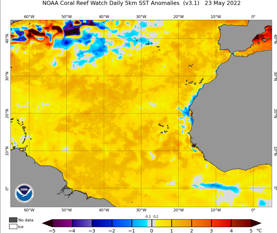
 its no wonder NOAA predicted 14-21 storms, 6-10 hurricanes, 3-6 major hurricanes!


