Taffy wrote:Please help me understand what the colors represent.
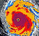
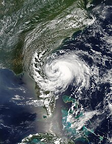
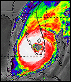
Taffy, at least with regard to the above map from Levi's site.... the colors in the map represent higher wind speeds at the 200mb level (upper level of the atmosphere). While the area of white may represent slower (more gentle) upper level winds over the Gulf of Mexico and eventually over Florida, of importance here is the direction of those winds (rather then the strength of them). The counter-clockwise rotation from this upper level low pressure feature tends to act as a pulley by grabbing hold of the rich and moist air extending from the W. Caribbean/Central America Inter-tropical Convergence Zone (ITCZ), and eventually yanking it up and northward over W. Cuba, Florida, and the Bahamas. Typically during the hurricane season, any time you might see a stream of 200mb "color" over an area of the tropics or sub-tropics this might suggest generally unfavorable upper air conditions for a tropical cyclone to either form or move into. El Nino years often cause these higher than normal upper level winds to stream across the Gulf of Mexico, Caribbean, and parts of the Atlantic. During more favorable condition years, these stronger upper level winds tend to remain in the higher northern latitudes with less often occasional dips to the south sometimes occurring over, near, or east of the Eastern CONUS.
Perhaps beyond the scope of your question but of interest in the longer term (days to week beyond) is whether this "weakness" in the upper levels might reflect a bit lower in the atmosphere to around the mid-level steering levels. If so... and depending on if more or less over Florida, just east of Florida, or altogether gone.... could play a steering role in any "potential" early Caribbean tropical system that the GFS model is consistently forecasting to take form in the 228 hour span.