Howdy folks:
I've got a quick favor to ask of you before the season gets going and things get busier. For the past few weeks, I've been working on changing my website design. Although I haven't finished with every section of the site, I ask everyone to check it out and see if everything looks OK on your browser. I've been having a lot of cross-browser problems (basically IE won't work and everything else seems to).
Website is here. IE users should see one page with a 2x2 table, and all other users will see another page with a javascript frame player. Javascript must be enabled for the page to fully function, especially for non-IE users to be directed to the correct page and have the frame player work.
A few links haven't been tied in yet; I'm mainly concerned about the layout and design right now. Thanks!
Scott
Website home page review: feedback appreciated
Moderator: S2k Moderators
Forum rules

The posts in this forum are NOT official forecasts and should not be used as such. They are just the opinion of the poster and may or may not be backed by sound meteorological data. They are NOT endorsed by any professional institution or STORM2K. For official information, please refer to products from the National Hurricane Center and National Weather Service.
-
ncweatherwizard
- Professional-Met

- Posts: 1243
- Joined: Wed Sep 03, 2003 9:45 am
- Location: Ft. Collins, CO
-
Opal storm

Re: Website home page review: feedback appreciated
I like it alot its easy to read and the blue is easy on the eyes. What color background will you be using when posting your forecasts?
0 likes
-
HURAKAN

- Professional-Met
- Posts: 46084
- Age: 39
- Joined: Thu May 20, 2004 4:34 pm
- Location: Key West, FL
- Contact:
Re: Website home page review: feedback appreciated
Opal storm wrote:I like it. Very professional looking.
Agree.
0 likes

Re: Website home page review: feedback appreciated
Looks good, menus work fine in IE 6. Nice job.

0 likes

-
ncweatherwizard
- Professional-Met
- Posts: 1243
- Joined: Wed Sep 03, 2003 9:45 am
- Location: Ft. Collins, CO
Re: Website home page review: feedback appreciated
boca wrote:I like it alot its easy to read and the blue is easy on the eyes. What color background will you be using when posting your forecasts?
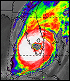
Well, I haven't really decided for sure yet. Here is an example of what I've come up with. It's dark enough to fit the theme, but light enough so that you can still read it. Let me know if it's too hard to read, and I'll play around with it.
0 likes
Re: Website home page review: feedback appreciated
ncweatherwizard wrote:boca wrote:I like it alot its easy to read and the blue is easy on the eyes. What color background will you be using when posting your forecasts?
Well, I haven't really decided for sure yet. Here is an example of what I've come up with. It's dark enough to fit the theme, but light enough so that you can still read it. Let me know if it's too hard to read, and I'll play around with it.
I like it a lot.For me its easier to read the forecasts in the blue that you used rather than the yellow used in the past.The site is very professional.
0 likes
Who is online
Users browsing this forum: pepecool20 and 175 guests