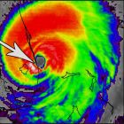
Hurrilurker wrote:SouthDadeFish wrote:https://i.imgur.com/VvsYXWl.png
Can someone please explain what this chart is and how to read it? I haven't seen them posted here much until this year. I guess it's some kind of pressure vs. dew point and temperature graph for a dropsonde and it means the core is stronger if the lines are straight up-down and closer together? But I don't understand it. And why are the vertical graph lines diagonal? Thanks in advance.
It indeed is a temperature/dew point vs pressure (T-p) graph for a dropsonde with wind barbs added at the side. The dots resemble the heights where temperature measurements were made. To derive the temperature and dewpoint at a certain height, just go from a point on the red or green graph to the bottom scale by moving parallel to the dashed slanted lines.
When the green line (dew point) and the red line (temperature) are close together, that simply means that the air is saturated with water vapor and the relative humidity is near 100%. This is common within clouds, fog or areas where humid air is rising and the water is about to condensate, like for example in the eyewall of a hurricane. In the eye the air is typically sinking which forces adiabatic heating and the humidity decreases a little. That's why you see the green and red lines separated from each other in a center dropsonde diagram.
I think here the diagrams are mainly used to visualize the wind speeds at different heights (which are also shown in the table on the right, together with all the 'decoded' temp and dew point data). Evaluating the strength of the core is easier with other tools, as these graphs do only show absolute temperatures, not the temperature differences between the core and the ambient air at the same level.
T-p diagrams do often have slanted vertical lines for temperature (those diagrams are called "skew-T"-diagrams). Two reasons for that. First, you can set the inclination of the isotherms (dashed lines of constant temperature) to a specific value to make a certain vertical temp profile appear as a straight vertical line. By doing that you can for example make assumptions about the stability of the atmosphere by just looking of the inclination of the T-line. Second, you need less space. There is no need for a +30°C line at 50000 feet or a -90°C line at the surface. Basically it avoids temperature curves that get too far out to the sides.


