I posted an earlier version of the first chart which contained my forecast cone (red and green dots). Today, I've updated it to indicate the NHC's cone (blue dots) and Franklin's actual movement (yellow dots):

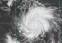
The below image is the latest available as I post, and contains my (red dots) and NHC (blue dots) forecast path: